 Sounds juicy doesn’t it, but first let’s get the terminology straight. For those of you that don’t know, Wikipedia defines skeuomorphism as:
A skeuomorph is a derivative object that retains ornamental design cues from structures that were necessary in the original. Examples include pottery embellished with imitation rivets reminiscent of similar pots made of metal and a software calendar that imitates the appearance of binding on a paper desk calendar.
I hadn’t even heard of this word until the last year or so when Apple decided to give iOS7 a big visual makeover, and the internet raged on with a debate on the philosophy of skeuomorph design. Many people are quite happy to see Apple get away from UI design that was modeled after familiar real world objects and give their iPhone and iPads a new modern look.
 However, with all the excitement for a new UI on iOS it seems that skeuomprphism has gotten a bad rap in recent days. Basing design on real world equivalents is nothing new for games though, in fact many games out there put enormous amount of time and money into making an accurate simulation of the real world itself and then throw some imagination and creativity into that world.
I’m a firm believer that the UI is a place you should really spend some time not only making it clear to the player what’s going on, but also making it fun to use and is an opportunity for your game to really shine with personality. As an added bonus, if your UI looks like something that the player already understands on some level you can get away with explaining and labeling a lot less which frees up super valuable screen real estate for other elements.
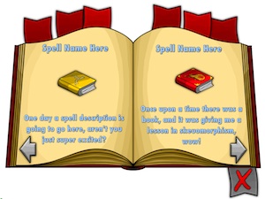
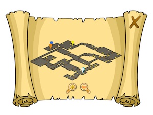
 For the upcoming role playing game, we’re designing the UI to be as clean and unobtrusive as possible while also being very animated and fun to use; skeuomorphism really helps in this area. A book looks like a book, it opens up, pages turn back and forth. A map unrolls like a piece of parchment would, and a bag looks like a bag. These elements need little explaining because you already have a working knowledge of what they should do.
Sprinkled around this page are some first version screenshots of a few UI elements we’re putting in. Once a real artist goes over and replaces all my placeholder programmer art, I think it’s gonna feel really nice to interact with.
Skeuomorphism isn’t really a bad word.


